Jetpack Compose Tutorial: Lesson 3
Today, I kept going with Google's Compose Essentials course. Here's a peek into what I explored and learned.
How Material Design is added to the app
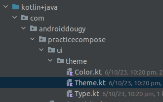
When you add a new Empty Compose Activity, it comes with a default theme. This theme is created with a Color.kt, Theme.kt and Type.kt files. If you're adding it in to an existing app, you can create these files yourself.
These files are used to create themed objects that are passed into the MaterialTheme composable. This composable is the parent of all the composables in the app. It provides the Material Design styling to all the composables.
@Composable
fun MaterialTheme(
    colorScheme: ColorScheme = MaterialTheme.colorScheme,
    shapes: Shapes = MaterialTheme.shapes,
    typography: Typography = MaterialTheme.typography,
    content: @Composable () -> Unit
)
To add the theme to a composable, you'll need to wrap it in the MaterialTheme composable.
@Preview
@Composable
fun PreviewMessageCard() {
    ThemeClass {
        Surface {
            MessageCard(
                msg = Message("Lexi", "Take a look at Jetpack Compose, it's great!")
            )
        }
    }
}
It seems like good practice to use the MaterialTheme to wrap the composables at the Activity level and the Preview level.
Part 1: Color
MaterialTheme.colorScheme sets the color.
There are lots of color attributes that can be set. Here are the first of them:
class ColorScheme(
    primary: Color,
    onPrimary: Color,
    primaryContainer: Color,
    onPrimaryContainer: Color,
    inversePrimary: Color,
    secondary: Color,
    onSecondary: Color,
    ...
)
This is how the Theme.kt file sets up the color schemes:
private val DarkColorScheme = darkColorScheme(
    primary = Purple80,
    secondary = PurpleGrey80,
    tertiary = Pink80
)

private val LightColorScheme = lightColorScheme(
    primary = Purple40,
    secondary = PurpleGrey40,
    tertiary = Pink40
)
These are then fed into the color scheme for the MaterialTheme with a dark mode check:
@Composable
fun PracticeComposeTheme(
    darkTheme: Boolean = isSystemInDarkTheme(),
    // Dynamic color is available on Android 12+
    dynamicColor: Boolean = true,
    content: @Composable () -> Unit
) {
    val colorScheme = when {
        dynamicColor && Build.VERSION.SDK_INT >= Build.VERSION_CODES.S -> {
            val context = LocalContext.current
            if (darkTheme) dynamicDarkColorScheme(context) else dynamicLightColorScheme(context)
        }

        darkTheme -> DarkColorScheme
        else -> LightColorScheme
    }
    MaterialTheme(
        colorScheme = colorScheme,
        ...
    )
Part 2: Typography
The typography is set with the MaterialTheme.typography function. It takes in a TextStyle object.
This is how we should set the text styles for our Text composables.
class Typography(
    val displayLarge: TextStyle = TypographyTokens.DisplayLarge,
    val displayMedium: TextStyle = TypographyTokens.DisplayMedium,
    val displaySmall: TextStyle = TypographyTokens.DisplaySmall,
    val headlineLarge: TextStyle = TypographyTokens.HeadlineLarge,
    val headlineMedium: TextStyle = TypographyTokens.HeadlineMedium,
    ...
)
Part 3: Shape
I'm not really sure how this is used, but it seems to be a store of the shapes that you'd use in the app. E.g. rounded rectangles for buttons, circles for profile pictures, etc.
Part 4: Dark Theme
Dark theme is handled by default.
The isSystemInDarkTheme() function checks if the system is in dark mode and sets the theme accordingly.
The @Preview annotation also has a darkTheme attribute that can be set to preview the dark theme.
@Preview(
    uiMode = Configuration.UI_MODE_NIGHT_YES,
    showBackground = true,
    name = "Dark Mode"
)
This is really useful so you can compare the light and dark themes side by side in the preview window.
Deep Dive Challenges
Exercise 1: Todo List App
Description: Imagine you're creating a simple task list app. The app has a header titled "Today's Tasks" and a list of tasks for the day.
- Build a task list item composable that displays the task name, a checkbox, and a due date.
- Create a Material Theme for this app.
- Apply the Material Theme to the task list item composable.
Colors - Light Mode:
- Primary: #4CAF50 (Green)
- Secondary: #FFC107 (Amber)
Colors - Dark Mode:
- Primary: #388E3C (Dark Green)
- Secondary: #FFA000 (Dark Amber)
Typography - Header:
- Font Size: 24sp
- Font Weight: Bold
Typography - Body:
- Font Size: 16sp
- Font Weight: Normal
Implementation:
The way I would approach this problem would be like this:
- Set up the data model for the task list item.
- Create a composable scaffold for the task list item.
- Create a set of previews to show the task list item in light and dark mode.
- Create a Material Theme for the app.
- Apply the Material Theme to the task list item composable.
Starting from the beginning, I created a new data model for the task list item.
data class Task(
    val taskName: String,
    val dueDate: Date,
    val done: Boolean
)
Then I created a composable for the task list item.
@Composable
fun TodoListItem(task: Task) {
    Row(modifier = Modifier.padding(8.dp)) {
        Column {
            Text(task.taskName)
            Text(task.dueDate.toString())
        }
        Spacer(modifier = Modifier.padding(8.dp))
        Image(
            painter = painterResource(if (task.done) R.drawable.ic_driving else R.drawable.ic_flying),
            modifier = Modifier.padding(8.dp).align(Alignment.CenterVertically),
            contentDescription = "Checkbox"
        )
    }
}
Then I created a set of previews to show the task list item in light and dark mode.
You can see that I've wrapped the TodoListItem in the PracticeTodoTheme composable.
This provides the Material Design styling to the TodoListItem.
This theme doesn't do too much extra for now. I've still yet to set the colors and typography for the theme.
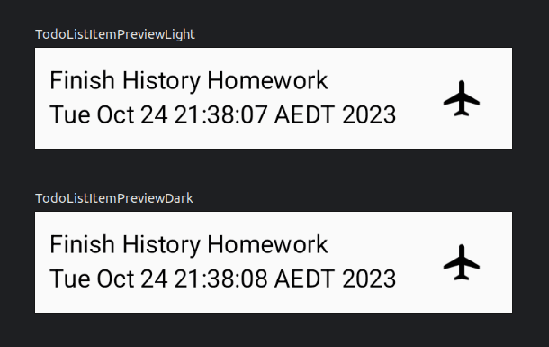
@Preview(showBackground = true, uiMode = UI_MODE_NIGHT_NO)
@Composable
fun TodoListItemPreviewLight() {
    PracticeTodoTheme {
        Surface {
            TodoListItem(
                Task(
                    taskName = "Finish History Homework",
                    dueDate = Calendar.getInstance().time,
                    done = false
                )
            )
        }
    }
}

@Preview(showBackground = true, uiMode = UI_MODE_NIGHT_YES)
@Composable
fun TodoListItemPreviewDark() {
    PracticeTodoTheme {
        Surface {
            TodoListItem(
                Task(
                    taskName = "Finish History Homework",
                    dueDate = Calendar.getInstance().time,
                    done = false
                )
            )
        }
    }
}
Edit: What I've learned is that you need to add a surface component to the preview to get the right background color to show up.
Then I got to work on building the Material Theme for the app.
I copied from the default Material Theme that was provided when I created the Empty Compose Activity.
I kept the DarkColorScheme and LightColorScheme objects and added my own colors to them.
private val DarkColorScheme = darkColorScheme(
    primary = Green,
    secondary = Amber,
)

private val LightColorScheme = lightColorScheme(
    primary = Dark_Green,
    secondary = Dark_Amber,
)
Then I created a TodoTypography object to hold the typography for the app.
val TodoTypography = Typography(
    titleSmall = TextStyle(
        fontFamily = FontFamily.Default,
        fontWeight = FontWeight.Bold,
        fontSize = 24.sp,
    ),
    bodyMedium = TextStyle(
        fontFamily = FontFamily.Default,
        fontWeight = FontWeight.Normal,
        fontSize = 16.sp,
    )
)
I packaged these up into a PracticeTodoTheme composable.
I also left the code to switch between the light and dark themes.
@Composable
fun PracticeTodoTheme(
    darkTheme: Boolean = isSystemInDarkTheme(),
    dynamicColor: Boolean = true,
    content: @Composable () -> Unit
) {
    val colorScheme = when {
        dynamicColor && Build.VERSION.SDK_INT >= Build.VERSION_CODES.S -> {
            val context = LocalContext.current
            if (darkTheme) dynamicDarkColorScheme(context) else dynamicLightColorScheme(context)
        }

        darkTheme -> DarkColorScheme
        else -> LightColorScheme
    }

    MaterialTheme(
        colorScheme = colorScheme,
        typography = TodoTypography,
        content = content
    )
}
Now that the theme is set up, I can apply it to the TodoListItem composable.
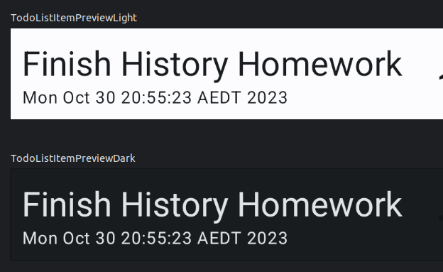
@Composable
fun TodoListItem(task: Task) {
    Row(modifier = Modifier.padding(8.dp)) {
        Column {
            Text(
                text = task.taskName,
                style = TodoTypography.headlineSmall
            )
            Text(
                text = task.dueDate.toString(),
                style = TodoTypography.bodySmall
            )
        }
        Spacer(modifier = Modifier.padding(8.dp))
        Image(
            painter = painterResource(if (task.done) R.drawable.ic_driving else R.drawable.ic_flying),
            modifier = Modifier.padding(8.dp).align(Alignment.CenterVertically),
            contentDescription = "Checkbox"
        )
    }
}
Scenario Exercise 2: Bookshelf App
Description: Visualize an app where users can see a list of books they've added to their personal bookshelf. The app has a header labeled "My Bookshelf" and a list showing book titles and authors.
For this task:
- Build another list item composable that displays the book's name, author and a cover image.
- Create a Material Theme for this app.
- Apply the Material Theme to the task list item composable.
Colors - Light Mode:
- Primary: #673AB7 (Deep Purple)
- Secondary: #E91E63 (Pink)
Colors - Dark Mode:
- Primary: #512DA8 (Dark Deep Purple)
- Secondary: #C2185B (Dark Pink)
Typography - Header:
- Font Size: 26sp
- Font Weight: Bold
Typography - Body:
- Font Size: 18sp
- Font Weight: Normal
Implementation:
Again, I will go through the same process.
- Set up the data model for the book list item.
- Create a composable scaffold for the book list item.
- Create a set of previews to show the book list item in light and dark mode.
- Create a Material Theme for the app.
- Apply the Material Theme to the book list item composable.
Starting from the beginning, I created a new data model for the book list item.
```Kotlin
data class Book(
    val title: String,
    val author: String,
    val coverUrl: String,
)
Then I created a composable for the book list item.
```Kotlin
@Composable
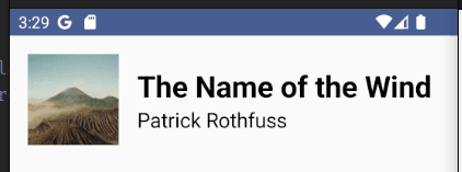
fun BookListItem(book: Book) {
Row {
AsyncImage(
model = book.coverUrl,
contentDescription = book.title,
contentScale = ContentScale.Crop,
modifier = Modifier
.size(128.dp)
)
Spacer(modifier = Modifier.size(16.dp))
Column {
Text(text = book.title, style = BookTypography.titleLarge)
Text(text = book.author, style = BookTypography.bodyLarge)
}
}
}
Then I created a set of previews to show the book list item in light and dark mode.
@Preview(showBackground = true, uiMode = Configuration.UI_MODE_NIGHT_NO)
@Composable
fun BookListItemPreviewLight() {
    PracticeBookTheme {
        BookListItem(
            Book(
                title = "The Name of the Wind",
                author = "Patrick Rothfuss",
                coverUrl = "https://picsum.photos/seed/34/200/300",
            )
        )
    }
}

@Preview(showBackground = true, uiMode = Configuration.UI_MODE_NIGHT_YES)
@Composable
fun BookListItemPreviewDark() {
    PracticeBookTheme {
        BookListItem(
            Book(
                title = "The Name of the Wind",
                author = "Patrick Rothfuss",
                coverUrl = "https://picsum.photos/seed/34/200/300",
            )
        )
    }
}
Then I got to work on building the Material Theme for the app. I set up the colors and typography for the theme.
val Deep_Purple = Color(0xFF673AB7)
val Pink = Color(0xFFE91E63)

val Dark_Deep_Purple = Color(0xFF512DA8)
val Dark_Pink = Color(0xFFC2185B)
val BookTypography = Typography(
    titleLarge = TextStyle(
        fontFamily = FontFamily.Default,
        fontWeight = FontWeight.Bold,
        fontSize = 26.sp,
    ),
    bodyLarge = TextStyle(
        fontFamily = FontFamily.Default,
        fontWeight = FontWeight.Normal,
        fontSize = 18.sp,
    )
)
I set up the color schemes for the theme.
private val DarkColorScheme = darkColorScheme(
    primary = Deep_Purple,
    secondary = Pink,
)

private val LightColorScheme = lightColorScheme(
    primary = Dark_Pink,
    secondary = Dark_Deep_Purple,
)
@Composable
fun PracticeBookTheme(
    darkTheme: Boolean = isSystemInDarkTheme(),
    dynamicColor: Boolean = true,
    content: @Composable () -> Unit
) {
    val colorScheme = when {
        dynamicColor && Build.VERSION.SDK_INT >= Build.VERSION_CODES.S -> {
            val context = LocalContext.current
            if (darkTheme) dynamicDarkColorScheme(context) else dynamicLightColorScheme(context)
        }

        darkTheme -> DarkColorScheme
        else -> LightColorScheme
    }

    MaterialTheme(
        colorScheme = colorScheme,
        typography = BookTypography,
        content = content
    )
}
Here is the final result: