Jetpack Compose Tutorial: Lesson 2
Today, I started Google's Compose Essentials course. Here's a peek into what I explored and learned.
Layouts
Layouts are what we build to provide a structure for the user interface. Normally we build in XML with nested widgets. This lesson taught me to build the layouts I know in Compose.
Part 1: Adding Multiple Texts
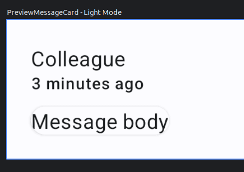
You can put add multiple composables in the same function.
@Composable
fun MessageCard(msg: Message) {
    Text(text = msg.author)
    Text(text = msg.body)
}
Without a structure, the elements will be laid over each other like a FrameLayout in XML.
Part 2: Columns and Rows
These are the equivalent to the LinearLayout vertical an horizontal orientation.
@Composable
fun MessageCard(msg: Message) {
    Column {
        Text(text = msg.author)
        Text(text = msg.body)
    }
}
The key takeaway here is that since it's a function, it can take in a parameter and generate a UI element based off this parameter. In this case the name parameter changes the string of the text.
Just like the first task, you won't be able to see any changes until you run it on a device. The good thing is that the tutorial website gives you a preview so you don't have to run it yourself.
Part 3: Images
Image resources are added using the painterResource.
Image(
    painter = painterResource(R.drawable.profile_picture),
    contentDescription = "Contact profile picture",
)
How do you load a an Image from URL like Picasso or Glide?
Part 4: Modifiers
Modifiers set the attributes for each element. They are like the widget attribute tags that you see in the XML files. e.g. "android:X" Put it in the constructor of the element.
Image(
    painter = painterResource(R.drawable.profile_picture),
    contentDescription = "Contact profile picture",
    modifier = Modifier
        .size(40.dp)
        .clip(CircleShape)
)
Things I like about this syntax:
- It has a fluent interface. All attributes are chained together
- Convenience methods for setting
spanddpdimensions - Lots of defaults and presets
Things that need getting used to:
- Chaining is ordered and may cause ordering issues.
Deep Dive Challenges
After finishing this Jetpack Compose lesson, I set up some more challenges for myself. Here's why - Doing these challenges helps me use what I learned in real situations, making sure I really get it. They also let me explore more parts of Compose that I might not see in the curated lesson.
Plus, figuring out these tasks is like solving real-world problems, giving me more confidence. And once I finish them, I have something to show, which is great for showcasing my skills or maybe even get job opportunities. It's a hands-on way to keep learning and get better at Android development.
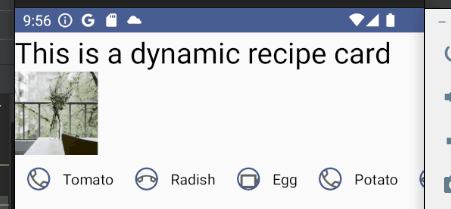
Challenge 1: Dynamic Recipe Card
Description: Create a RecipeCard Composable function that displays a recipe. The card should have:
- A column layout.
- A title at the top in a larger font.
- An image below the title, representing the dish (you can use a placeholder or an image from a URL).
- Below the image, display ingredients in a row layout. For simplicity, display up to four ingredients with small icons next to each (use any icons or placeholders you have).
This challenge will help me combine rows and columns effectively to design a neat, structured UI component.
Implementation:
At a high level, I created a DynamicRecipeCard composable that takes in a title, image URL, and a list of ingredients.
I modeled the ingredients as a list of pairs of strings and integers. The string is the name of the ingredient and the integer is the resource id of an icon.
For the exercise, I just used default system icons.
Here is the skeleton I started with:
@Composable
fun DynamicRecipeCard(title: String, heroImageUrl: String, ingredientList: List<Pair<String, Int>>) {

}

@Preview(group = "DynamicRecipeCard", showBackground = true)
@Composable
fun PreviewDynamicRecipeCard() {
    PracticeComposeTheme {
        DynamicRecipeCard(
            title = "This is a dynamic recipe card",
            heroImageUrl = "https://picsum.photos/200",
            ingredientList = listOf(
                "Tomato" to androidx.core.R.drawable.ic_call_answer,
                "Radish" to androidx.core.R.drawable.ic_call_decline,
                "Egg" to androidx.core.R.drawable.ic_call_answer_video,
                "Potato" to androidx.core.R.drawable.ic_call_answer,
                "Celery" to androidx.core.R.drawable.ic_call_decline,
                "Mushroom" to androidx.core.R.drawable.ic_call_answer_video,
            )
        )
    }
}
To load images from URL, I used the Coil library. It's a lightweight library that's easy to use and integrates well with Compose.
The alternative was to use the Image composable with the painterResource method. This method loads images from the res/drawable folder. I could have used this method if I had the images in the project folder, but that would've been a lot of work. I would have to download the images, add them to the project, and then load them. It's much easier to use the library to load images from URL.
Adding in the Coil dependencies to load images from URL. One is for the library and the other is for the Compose integration.
dependencies {
    ...
    implementation("io.coil-kt:coil:2.4.0")
    implementation("io.coil-kt:coil-compose:2.4.0")
}
The Coil library provides an AsyncImage composable that loads images straight from the URL. It's pretty lightweight and easy to use.
AsyncImage(
    model = heroImageUrl,
    contentDescription = "Recipe image",
    modifier = Modifier
        .size(80.dp)
)
Since each ingredient needs to be displayed with an icon, I created a separate IngredientCard composable that takes in a name and an icon resource id.
@Composable
fun IngredientCard(ingredient: String, icon: Int) {
    Row(
        modifier = Modifier
            .padding(8.dp),
        horizontalArrangement = Arrangement.SpaceBetween,
        verticalAlignment = Alignment.CenterVertically
    ) {
        Image(
            painter = painterResource(icon),
            contentDescription = "profile picture",
            modifier = Modifier
                .size(30.dp)
                .padding(4.dp)
                .clip(CircleShape)
                .border(1.5.dp, MaterialTheme.colorScheme.primary, CircleShape)
        )
        Spacer(modifier = Modifier.size(8.dp))
        Text(text = ingredient, style = MaterialTheme.typography.bodyMedium)
    }
}
I finally completed the DynamicRecipeCard composable by adding composables for the title, image, and ingredient list.
Since there were potentially more ingredients than the screen could fit, I used the LazyRow to only load the ingredients that are visible on the screen. It's similar to the RecyclerView in Android.
Here's the final implementation of the DynamicRecipeCard composable.
@Composable
fun DynamicRecipeCard(
    title: String,
    heroImageUrl: String,
    ingredientList: List<Pair<String, Int>>
) {
    Column(modifier = Modifier.fillMaxWidth()) {
        Text(text = title, style = MaterialTheme.typography.headlineMedium)
        AsyncImage(
            model = heroImageUrl,
            contentDescription = "Recipe image",
            modifier = Modifier
                .size(80.dp)
        )
        LazyRow {
            items(ingredientList) { ingredient ->
                IngredientCard(
                    ingredient = ingredient.first,
                    icon = ingredient.second
                )
            }
        }
    }
}
This is what it looks like in the preview:
Reflection: It would be much better if I started with a single data object to hold all the attributes of the recipe. That way, I could have used the data model to generate the UI elements rather than separate bits of information. This would prevent the need to pass in multiple parameters to the composable and make it easier to extend the recipe card in the future.
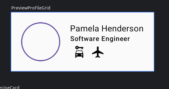
Challenge 2: Profile Information Grid
Description: Design a ProfileGrid Composable function that showcases user profile information in the following manner:
- A row layout for the top level.
- The first item in the row is a user's profile picture (use a circular shape and placeholder).
- The second item is a column that contains:
- The user's name in a bold font.
- The user's occupation just below the name.
- A row of up to three badges/icons indicating the user's skills or hobbies.
This challenge will push me to nest rows and columns, giving me practice in handling more intricate UI designs using Jetpack Compose.
Implementation:
Just like the previous challenge, I started with a data model and built an initial scaffold around that. Here, I built a class for the profile information, a composable to display it and a preview. I took the creative liberty to shape the indicators to represent the user's skills in operation transport vehicles. For simplicity, I used a car, boat, and plane icons from the clip art to represent driving, sailing, and flying.
data class Profile(
    val avatarUrl: String,
    val name: String,
    val occupation: String,
    val canDrive: Boolean,
    val canSail: Boolean,
    val canFly: Boolean
)

@Composable
fun ProfileGrid(profile: Profile) {

}

@Preview
@Composable
fun PreviewProfileGrid() {
    ProfileGrid(
        Profile(
            avatarUrl = "https://picsum.photos/200",
            name = "Pamela Henderson",
            occupation = "Software Engineer",
            canDrive = true,
            canSail = false,
            canFly = true
        )
    )
}
I realise that each mode of transport needs to have its own icon, so I created a separate composable for each indicator. This will reduce the need to repeat code and keep the styling consistent.
@Composable
fun TransportSkill(icon: Int) {
    Image(
        painter = painterResource(icon),
        contentDescription = "skill icon",
        modifier = Modifier
            .size(30.dp)
            .padding(4.dp)
            .clip(CircleShape)
            .border(1.5.dp, MaterialTheme.colorScheme.primary, CircleShape)
    )
}
Putting it all together, I created the ProfileGrid composable that takes in a Profile object and displays the information in a row layout:
@Composable
fun ProfileGrid(profile: Profile) {
    Row {
        AsyncImage(
            model = profile.avatarUrl,
            contentDescription = "Profile picture",
            modifier = Modifier
                .size(80.dp)
                .clip(CircleShape)
                .border(1.5.dp, MaterialTheme.colorScheme.primary, CircleShape)
        )
        Column {
            Text(text = profile.name, style = MaterialTheme.typography.bodyMedium)
            Text(text = profile.occupation, style = MaterialTheme.typography.labelSmall)
            Row {
                if (profile.canDrive) {
                    TransportSkill(R.drawable.ic_driving)
                }
                if (profile.canSail) {
                    TransportSkill(R.drawable.ic_sailing)
                }
                if (profile.canFly) {
                    TransportSkill(R.drawable.ic_flying)
                }
            }
        }
    }
}